Belen Cao, the Spanish designer at the National Gallery’s exhibitions
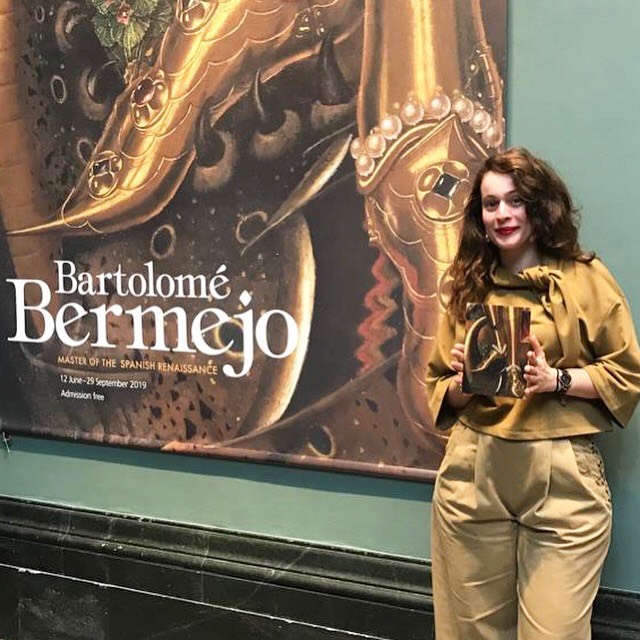
Belen Cao has always been fascinated by both writing and drawing and studied a degree in Journalism and Audiovisual Communication from the Antonio de Nebrija University in Madrid (2009). Since then, she has worked in small press offices and, in doing so, she began to redirect her career towards Graphic Design.
In 2012, Cao completed a one-year professional Masters in this subject at the Trazos school in Madrid. Followed by a year in Digital Illustration at the ESDIP school in Madrid (2014) and finally, a Master of the Arts at Kingston University, London in Graphic Design and Visual Communication in which she graduated with honors in 2016. Her academic studies have also been informed by extracurricular learning such as courses in animation, drawing, typography and printing methods.
Cao began her career at London’s National Gallery in December 2016 after a brief period of volunteering as an art teacher at an elementary school in South East London. She combined the volunteering with freelance designer work for Associated Studios, a training school for Young students of Theater and Opera.
What projects have you worked on recently?
Since I started working at the National Gallery, I have worked on numerous exhibitions. My initiation rite was with one of the heavyweights of the Renaissance and his disciple: Michelangelo & Sebastiano. The truth is that I will never forget it. I entered when the exhibition was already half completed and I had to catch up with everything as fast as I could to not disappoint the expectations of my employers, and of course my own. This situation was a stressful, especially because I was not working in my mother tongue, but it was also immensely satisfying once it was finished.
During my 3 years at the National Gallery, I have designed approximately 14 exhibitions including 3 exhibits of Spanish monographs from a range of different time periods.
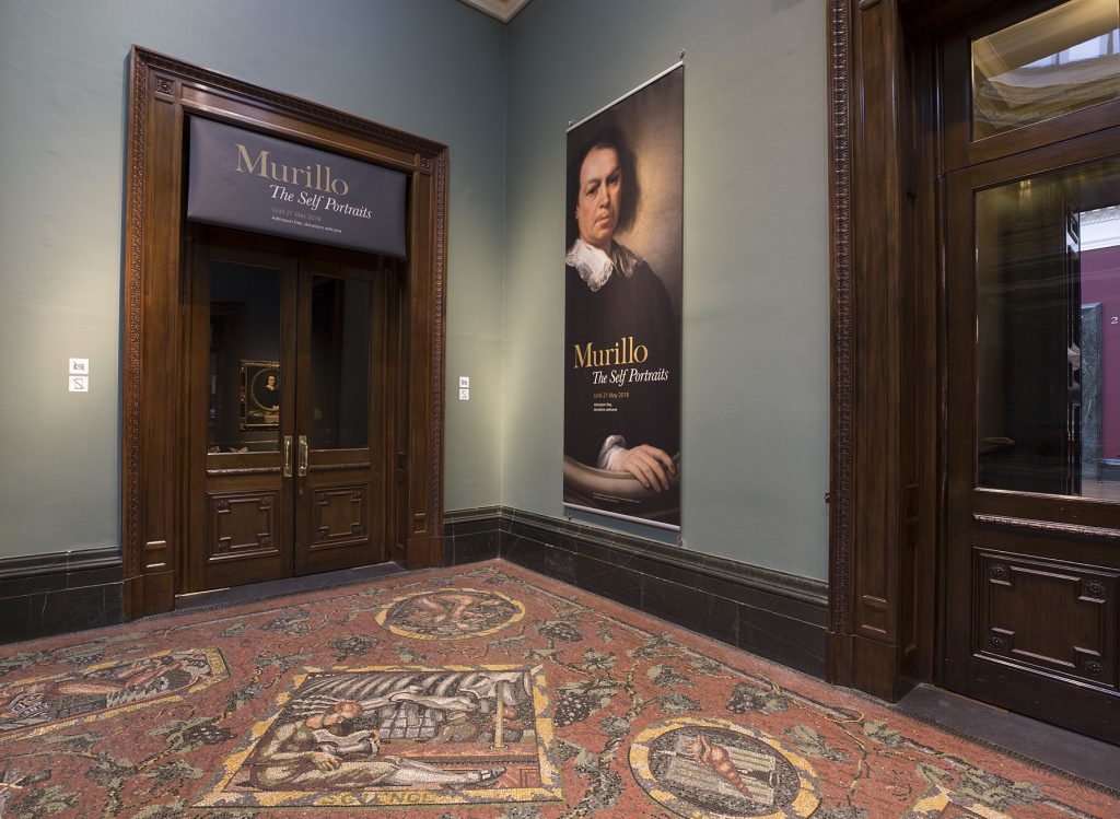
In 2017, at the centrepiece of the Self-portraits exhibition we had the Spanish baroque painter, Murillo. The central paintings were all on loan from the New York Frick collection which included and our famous self-portrait. It shows a more experienced Murillo with his hand outside the frame, building A magnificent trap.
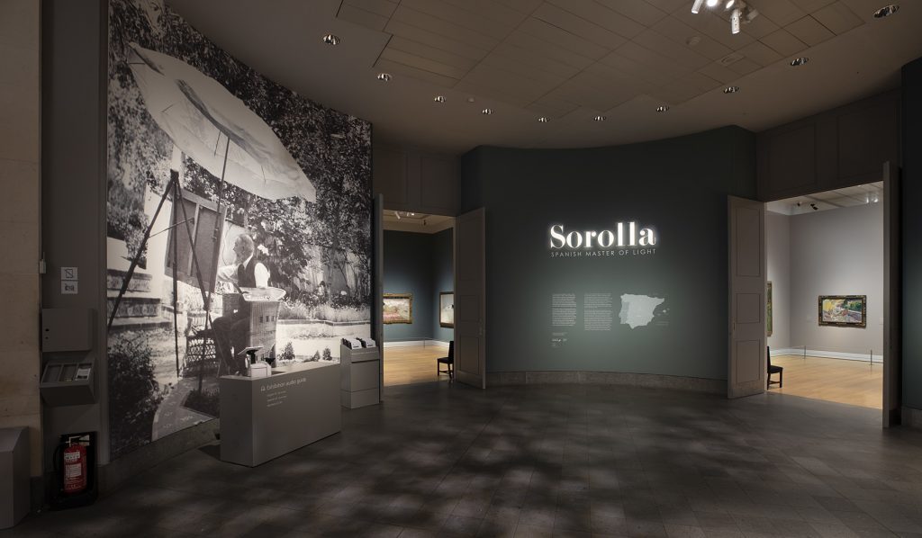
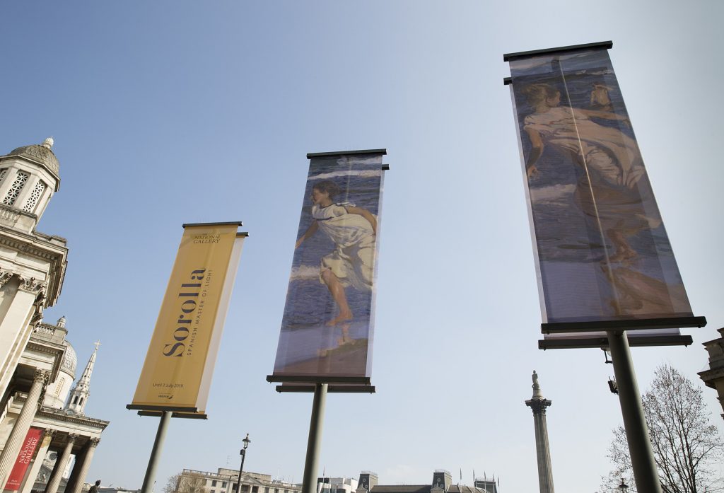
At the beginning of 2019, we jumped from the Baroque to the Impressionism of the 19th century. During this time, I had the magnificent opportunity to design the Sorolla exhibition: Spanish Master of Light and collaborated closely with his great-granddaughter, Blanca Pons-Sorolla. I can also thank my very talented companion and friend, Akemi Herráez Vossbrink, curator of the exhibition together with Chris Riopelle for their help. On this occasion, the title of the exhibition gave me the key to the concept of design: The Light. Here the challenge was that of how to introduce the feeling of being in one of the beautiful landscapes of the impressionist painter. The concept was clear, the methods for obtaining it not so much. After several meetings with our lighting technicians, I envisioned the possibility of projecting Sorolla’s name on a large scale and introducing diffused light by means of gobos at the entrance to the exhibition space that simulated light passing through the leaves of the trees. I have to say that I experienced an almost childlike joy throughout the entire process of the Sorolla exhibition. In everything from the beginning of the creative concept to the design of the leaflets with translucent paper which made them so enticing that they sold out in 2 weeks rather than the predicted 2 months. The public reception was exceptional; the attendance expectations tripled and even today, when the exhibition closed several months ago, I am frequently met with members of the public who tell me that they were so moved by the painter that, even though he was unknown to them initially, now they will never forget him.
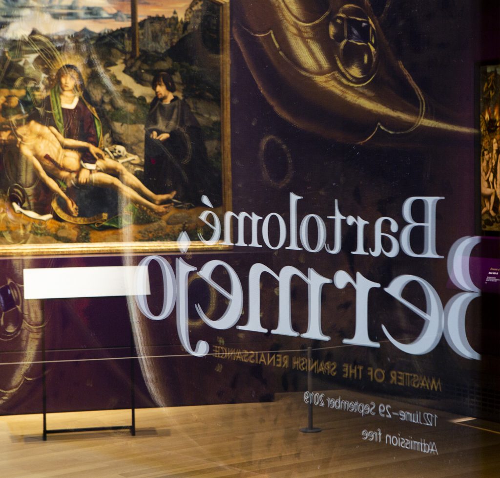
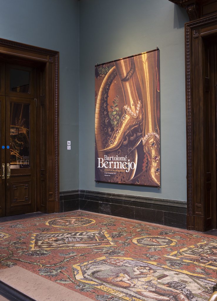
2019 also saw an even greater leap from Impressionism to the Gothic, Bartolomé Bermejo: Spanish Master of the Renaissance. This exhibition was a collaboration with the Prado Museum and the MNAC of Barcelona and was a great opportunity for me as a designer to bring Classic design into a more theatrical production. I incorporated the use of three-dimensional letters in gold, botanic elements which have a strong symbology in Bermejo as well as rhinestones (pearls and cabochons) to accentuate the jewellery elements frequently included in the production of the painter.
Who or what inspires you to do your work?
Inspiration comes when you least expect it. Sometimes walking through the forest, suddenly you see how the light hits the ground as it passes through the leaves and there you have it. Sometimes you stop to look at a shop window and there are those pearls that capture the light in a wonderful way, and you think, what if we put them next to Bermejo? They would look so beautiful. But most of the time it is a combination of observing your surroundings, absorbing inspiration (often from other exhibitions, photographs, theatre sets, ballet, opera and even passionate conversations with friends and colleagues) and looking in detail at the paintings included in the exhibition. The works themselves will always give you the keys to the consistency of the design. Sometimes there are slight artistic disparities between the visions of curators but the truth is, it is wonderful to work with the team of curators of the National Gallery. I feel that they love my work and this leads me to always want to do my best and go one step further whilst also helping and encouraging them.
What places do you recommend in London as a designer?
I always like to visit other museums that inspire me and hold such knowledge. I usually like to go to the Design Museum, the Tate (in fact, since I have mentioned the theme of light, I highly recommend going to see Olafur Eliasson’s facilities) and the Victoria & Albert Museum. The Summer Exhibition at the Royal Academy is always very fun, I highly recommend it, in fact I have some projects programmed for next year. Clerkenwell Design Week is also always inspiring and varied and I recommend being aware of Central St Martins and Goldsmiths University’s exhibitions. I always enjoy being inspired by bookstores and even seeing the designs of artists in showcases of luxury stores (especially at Christmas), which are abound here in London: those of New Bond Street are particularly beautiful.
What projects are you working on at the moment?
At this moment, I just opened Leonardo: An Immersive Experience, in which I have been in charge of creating the Blue Angel (which we are using for the marketing campaign and the cover of the catalogue). It is a mixture of layers upon layers in Photoshop with different opacities and fusion modes, combining Leonardo’s work with microscopic pigments of the painting. It has been the most interesting and enriching collaboration alongside my partner in the scientific department, Marika Spring. It is then followed by Nicolaes Maes: Dutch Master of the Golden Age, in the same space as Leonardo in February 2020. At the moment I am immersed in the creative concept of the next exhibition in room 1, SIN. It promises everything and more and it will be a fantastic effort to bring religious themes into an increasingly secular society in an engaging and relevant way.
